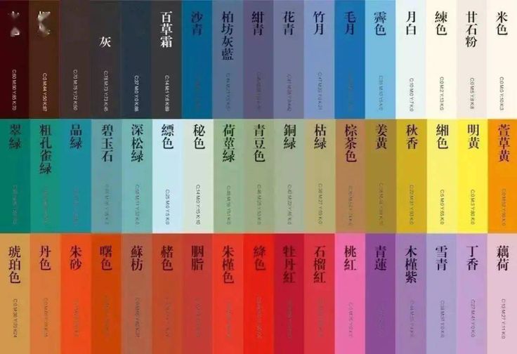
Timeless Chinese Color Proverbs: Ancient Wisdom in Modern Jewelry Design
Color harmony has always been at the heart of beauty — whether in fashion, painting, or jewelry.
In ancient China, artisans and scholars turned centuries of color wisdom into poetic proverbs.
Passed down through generations, these sayings reveal how colors interact — not only visually, but emotionally and aesthetically.
At Peonyjewels, we believe these ancient mantras can inspire your jewelry style — making it personal, elegant, and effortlessly balanced. Let’s rediscover these colorful nuggets of wisdom and see how they can guide your jewelry choices and daily styling.
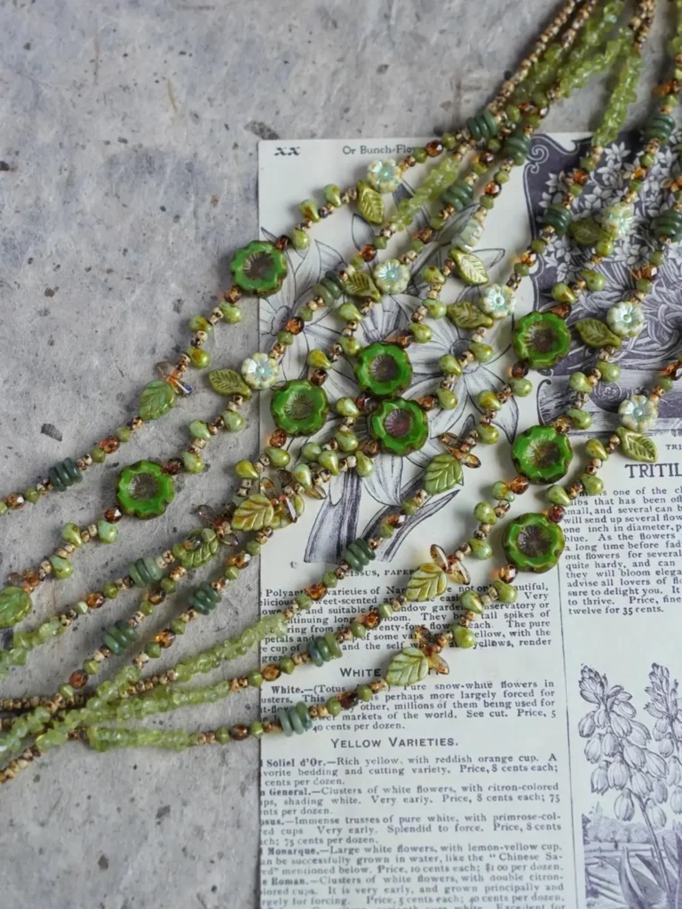
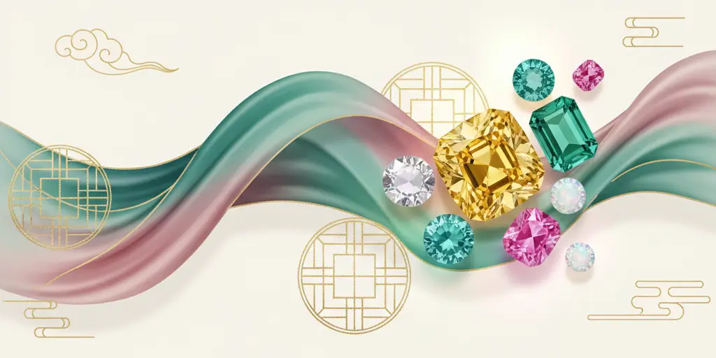
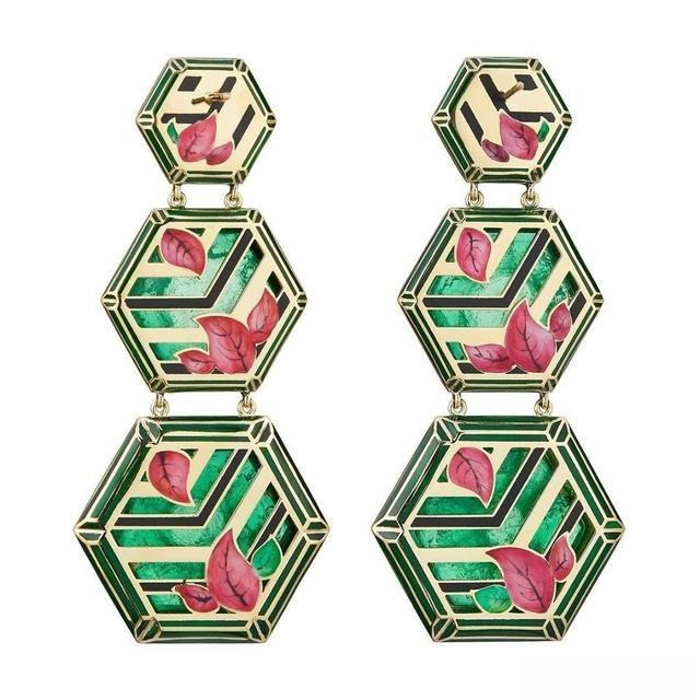
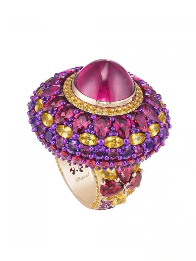
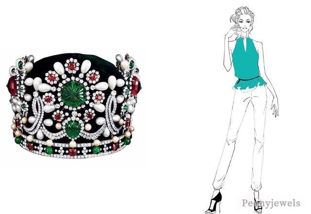
The Beauty of Balance — “Many Colors Without Chaos, Few Colors Without Emptiness”
When you look at folk paintings or antique porcelain, you often see a dazzling array of colors — yet somehow, they never feel messy.
The secret? Balancing saturation and temperature — mixing warm and cool tones of different intensities. This technique creates order within diversity.
In jewelry, designers like Cartier or Chopard apply the same rule, arranging gems of different colors and cuts to compose multi-hued masterpieces that never feel chaotic.
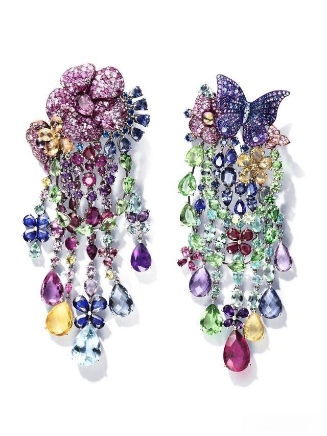
Tip for daily wear: try not to wear more than three main colors at once — anything more can get visually overwhelming.
“Soft Meets Hard, the Colors Stay Sharp” — The Art of Contrast
In Chinese proverb: “Soft leans on hard, the color won’t dull.”
Soft colors are gentle, delicate tones — pastel blue, milk white, mint green. Hard colors are deeper, higher-contrast shades — black, deep blue, emerald.
Pairing soft with hard creates a subtle contrast: it brightens your look without exaggeration.
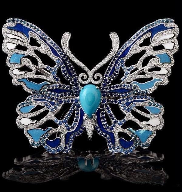
A turquoise and white gold butterfly brooch by Master Exclusive and a tourmaline and white gold ring by Lorenz Bäumer perfectly demonstrate this principle — the gentle tones gain depth when paired with stronger hues.
This trick works in jewelry and fashion alike — a soft outfit can be instantly elevated with a dark accent, like a black belt or a statement ring.
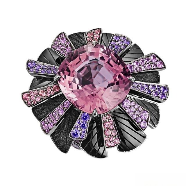
“To Refine the Look, Add a Touch of Black”— Subtle Elegance with Chinese Color Proverbs
In traditional Chinese art, there was a saying: “If you wish for refinement, add some ‘qing’.”
Here, “qing” doesn’t mean blue or green — it refers to black, used as an accent to enhance contrast and depth.
Painters often outlined collars or cuffs with a fine black edge to make soft colors appear more delicate and alive.
Jewelry designers follow the same rule — a touch of black enamel or onyx instantly adds structure and elegance.
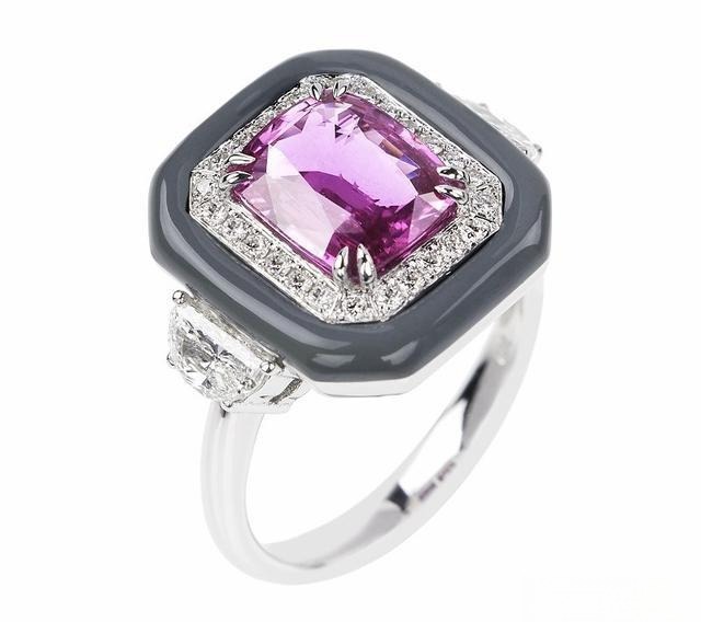
For instance, Nikos Koulis’s “Oui” pink sapphire and white gold ring and Chanel’s “Jeanne” sapphire earrings use black enamel to create sharp yet elegant contrast, adding a touch of luxury.
And in fashion? Try a slim black belt. It quietly sharpens your look and brings balance to the entire outfit.
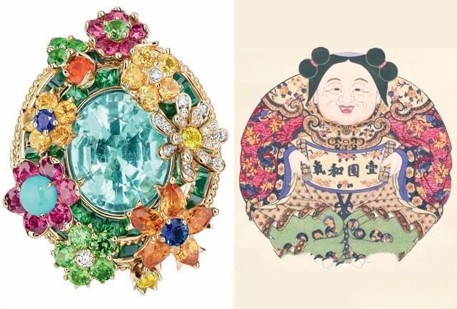
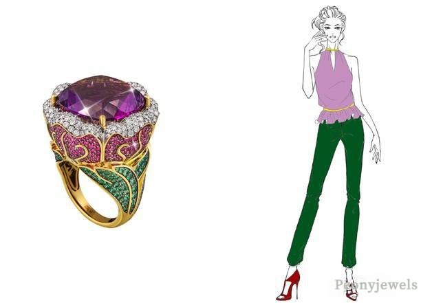
“Red with Yellow Shines Bright — Red Mixed with Yellow Brings Joy”
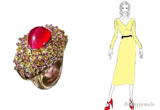
This saying celebrates the warmth of red and yellow, both energetic and festive hues.
When balanced thoughtfully — adjusting brightness and proportion — the combination feels radiant, not overpowering.
That’s why gold and ruby jewelry by designers like Wallace Chan or Chopard embody prosperity and happiness.
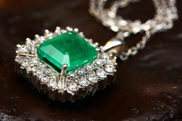
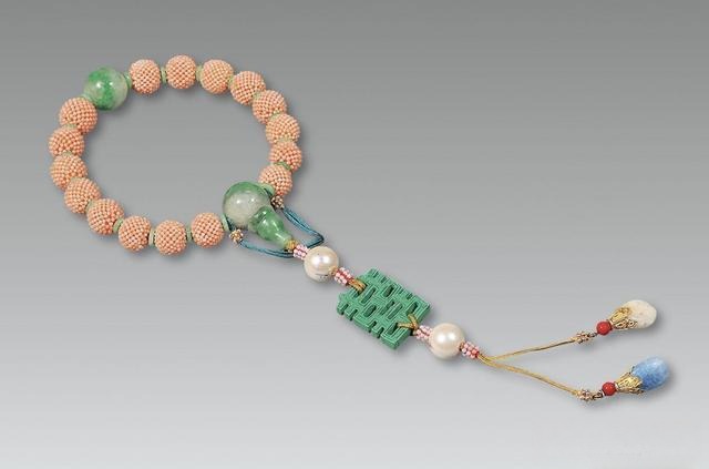
“Delicate Beauty Lies in Blue and Green”— Pure Blue and Green in Chinese Color Proverbs
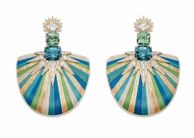
Another proverb goes: “Pure blue and green reveal fine character.”
In painting, blue garments with green belts — or green garments with blue and pink belts — made figures look elegant and refined.
In jewelry, Paraíba tourmaline represents this perfect harmony of cool clarity and inner brilliance — a visual poem of serenity and grace.
“To Stand Out, Add Some White”— Balancing Colors with Chinese Color Proverbs
The Chinese word “孝 (xiao)” here symbolizes white.
Adding a touch of white balances strong colors and draws focus to the subject — just like snow over spring blossoms.
From Art Nouveau enamel brooches to white opal bracelets, a whisper of white brings freshness and luminosity to any look.
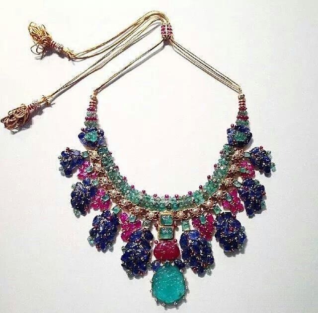
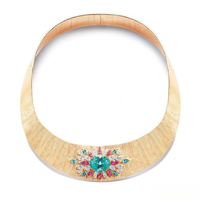
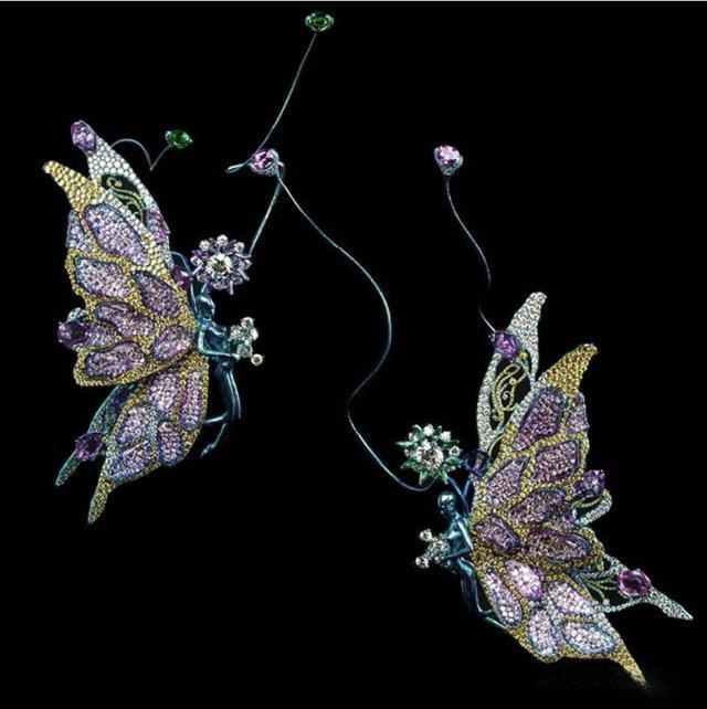
“Red and Green Bloom Together” — The Secret of Complementary Colors
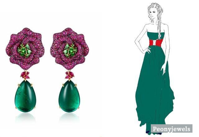
Red and green — often joked about as a “forbidden pairing” — are actually complementary colors. Used in the right proportion, they enhance each other beautifully.
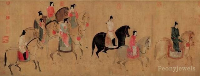
Historically, during the Tang dynasty, this vivid pairing signaled luxury — red dresses with green sashes, seen in paintings like “Lady Guoguo’s Spring Outing.”
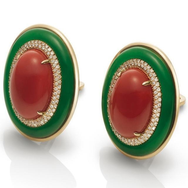
In jewelry, emerald and coral combinations can be strikingly elegant when one color leads and the other accents — lively yet sophisticated.
Mini Lesson: When two colors of light mix in just the right proportion to create a sense of white, they become complementary colors. In design and styling, highlighting one color over the other amplifies the contrast, making the composition bold, striking, and visually captivating.
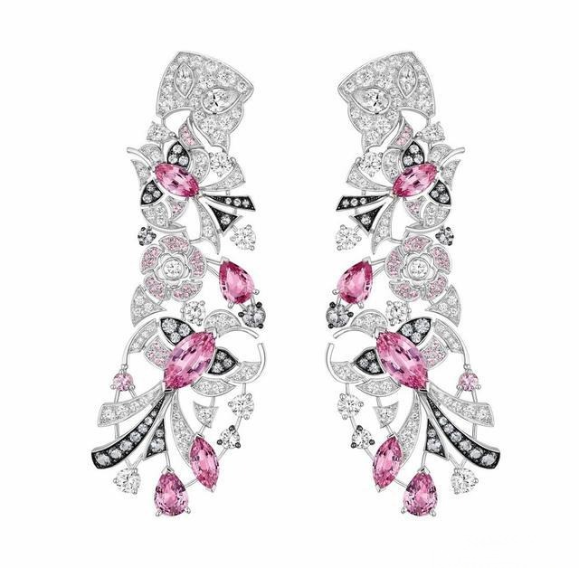
“Pink Embraces Yellow — Radiance Enhanced”
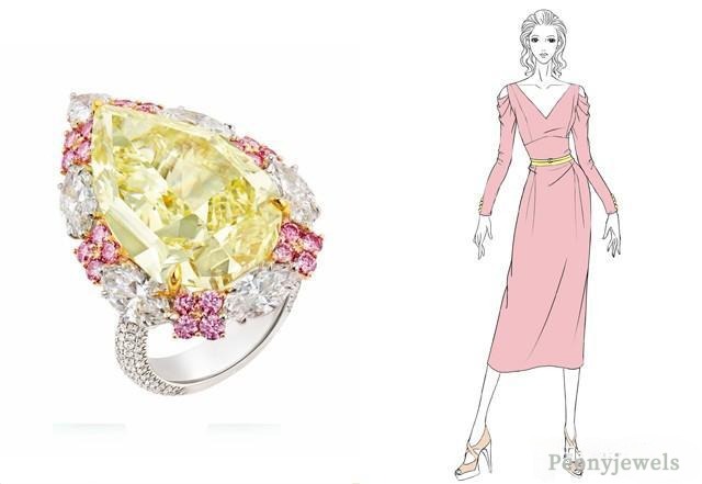
Soft pink and warm yellow together radiate tenderness and charm.
Yet, proportion is key — one should lead, the other should sparkle as a highlight.
Just like Cindy Chao’s pink conch pearl earrings, the right balance delivers a dreamy, glowing effect.
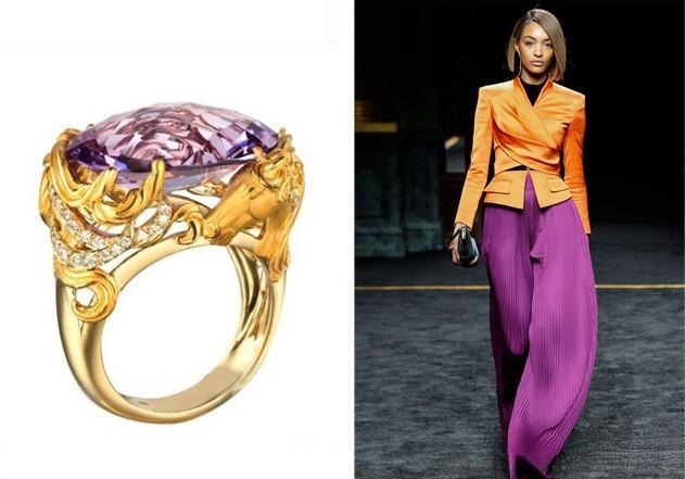
“Violet Is the Bone, Green Is the Vein — Add Red or Yellow for Harmony”
Purple and green can be tricky — both are intense and competing hues.
Ancient colorists advised softening them with a hint of red or yellow to unify the palette.
Modern jewelry masters, from Gevorgian to Carrera y Carrera, still follow this wisdom — using gold or ruby tones to harmonize bold gemstone contrasts.
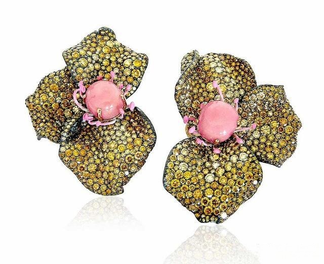
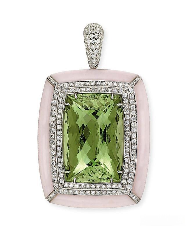
“Soft Green Draped in Pink — Grace in Harmony”
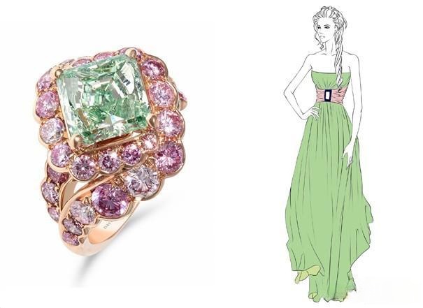
This poetic line describes pairing light green with blush pink, two gentle complements that enhance each other’s purity.
The effect is ethereal — like early spring sunlight over peach blossoms.
In jewelry, beryl and pink opal embody this softness, creating an elegant and feminine aura.
When Colors Clash | Chinese Color Proverbs Tips
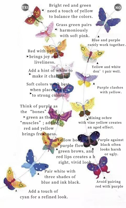
Ancient wisdom also warns of disharmonious combinations:
- “Blue with purple — lifeless.”
- “Purple next to black — painfully dull.”
These sayings remind us that color harmony is not just about beauty, but balance — the same principle behind timeless design.
Conclusion: Rediscover the Harmony of Colors with Peonyjewels
These ancient color proverbs are not just poetic words — they are living guides to aesthetic balance.
Whether painting, dressing, or designing jewelry, they teach us how to create beauty that feels effortless, natural, and deeply human.
At Peonyjewels, we honor this legacy by crafting handmade vintage earrings and jewelry that echo the grace of traditional Chinese color wisdom.
Which ancient Chinese color proverbs will guide your next jewelry choice?